Next steps
I wanted there to be more content on the site. It's not only links and resources that people need, but personal experiences too. There are many small buts of useful information you will only find on forums like Reddit, or by actually talking to seniors. The website I created was really only meant to display a some links and a few smaller pages.
The website needed a refresh. Not only did it need to have a list of links and resources, but also a space for text content, pages, and other similar pages.
Husker
I spent 2-3 days in the winter break after my semester rewriting the entire the website. There are various changes from the first version.
Sidebar
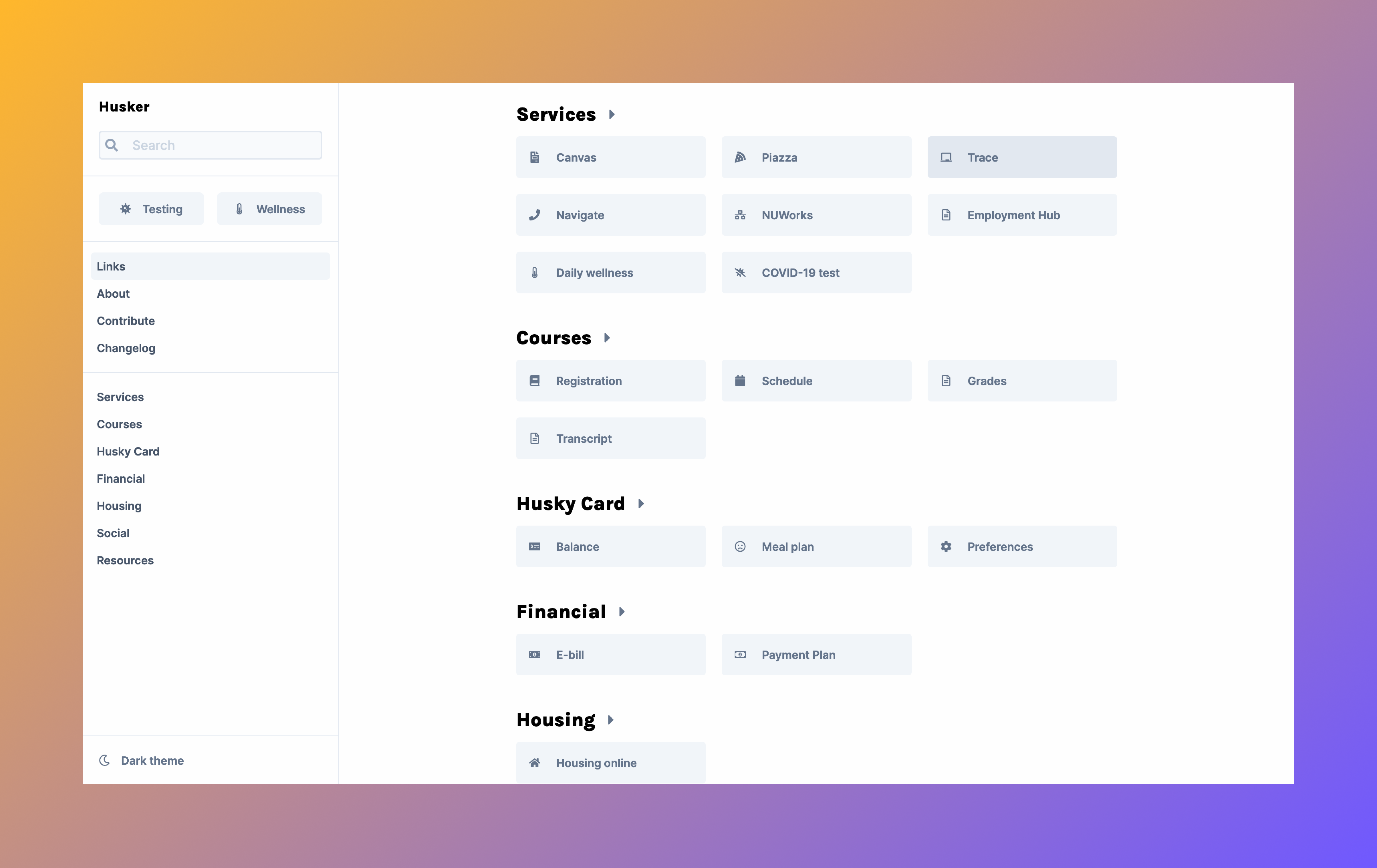
The sidebar is always present on the desktop view. I thought that this would make it easier to navigate around the website. The first version of the site had a top navigation bar. I was originally going for that in the redesign too, but there were too many links to add.
I also wanted to add "highlighted" links, which would be resources or links accessed often by students. At the start of the spring semester of 2022, every student was required to take a COVID-19 test every week. I thought that it would be incredibly convenient to have the link to schedule a test on the sidebar, always in view.
Mobile
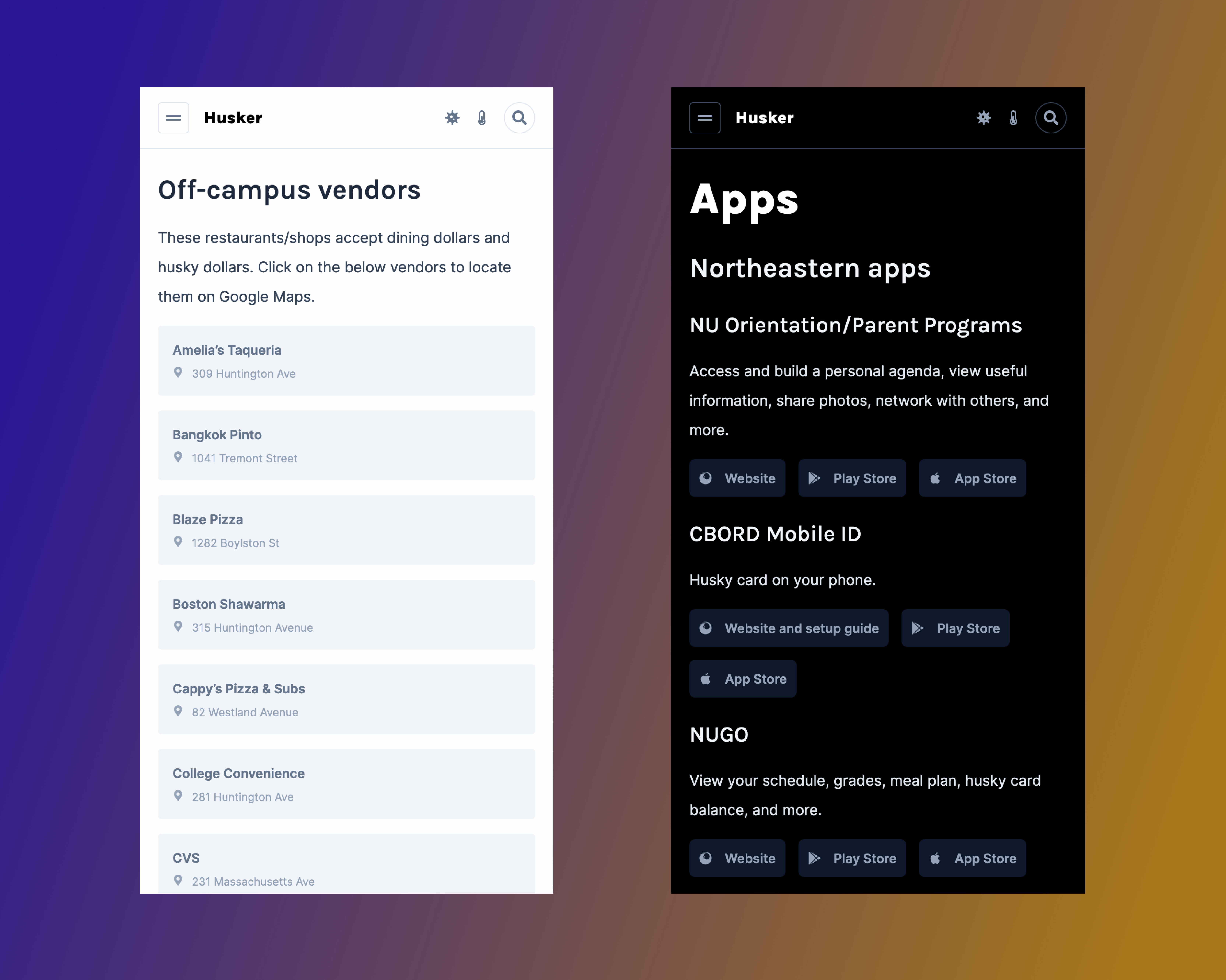
On the mobile view of the website, there is a top navigation bar, and the sidebar is hidden behind a menu button. I did not plan to have this navbar on mobile, but at the same I did want "highlighted" links to always be in view.
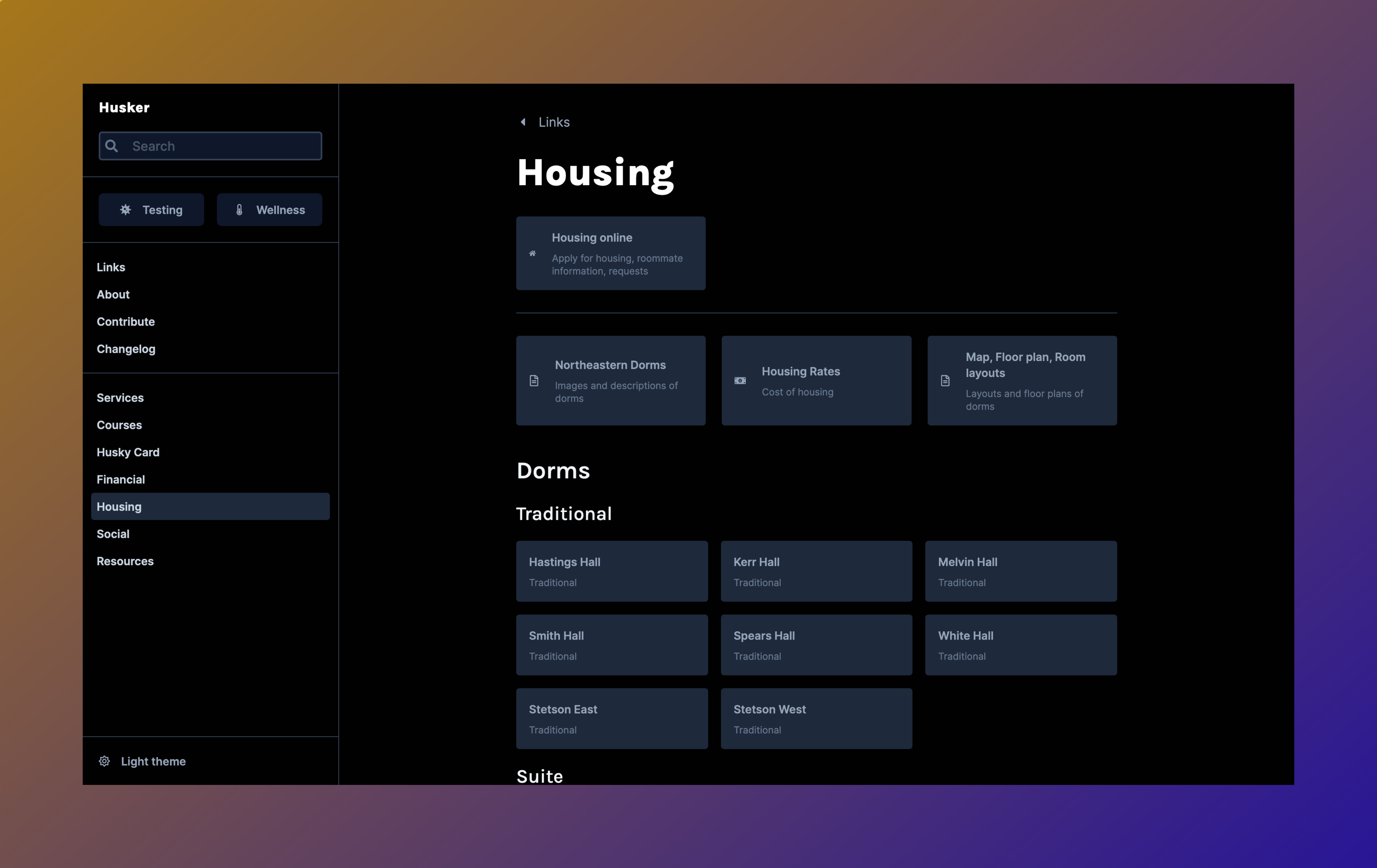
Links
I originally thought the masonry style links grid was cool, but it does look a little disorganized now. I got the idea from tiptap.dev.
The new link component contains an icon, title, and short description. On the main page, the description of the links are not shown as they are the commonly accessed resources.
Search
There's search now! It is pretty bare bones at the moment, but you can also search for courses!
UI design and colors
I have purposely tried to make the UI as simple and forgettable as possible. For a website like this which only contains buttons and links, I do believe that there shouldn't be that much of a UI. Just content, no UI.
Also, there's dark mode!
Contribute form
Anyone with a suggestion for a link or resources can fill out the contribute form. No sign ups required!
This form is actually a Google Form in disguise (read how I did it). I was going to make database in Firebase, but that was too much work for such a simple form.
What does Husker mean?
Nothing.
I didn't like the first name "NEU Links" and was trying to think of a new one before redesigning the site. I thought name is something husky.
I wanted to keep the site title as Husky temporary, but I ended up typing Husker instead somehow. I liked how it looked so I left it.
When I pushed it, I kind of forgot about it until a friend called it Husker, and it just stuck.