The UI is currently very simple and displays data without being too fancy. On the index page, there's a list of gyms and how busy they are.
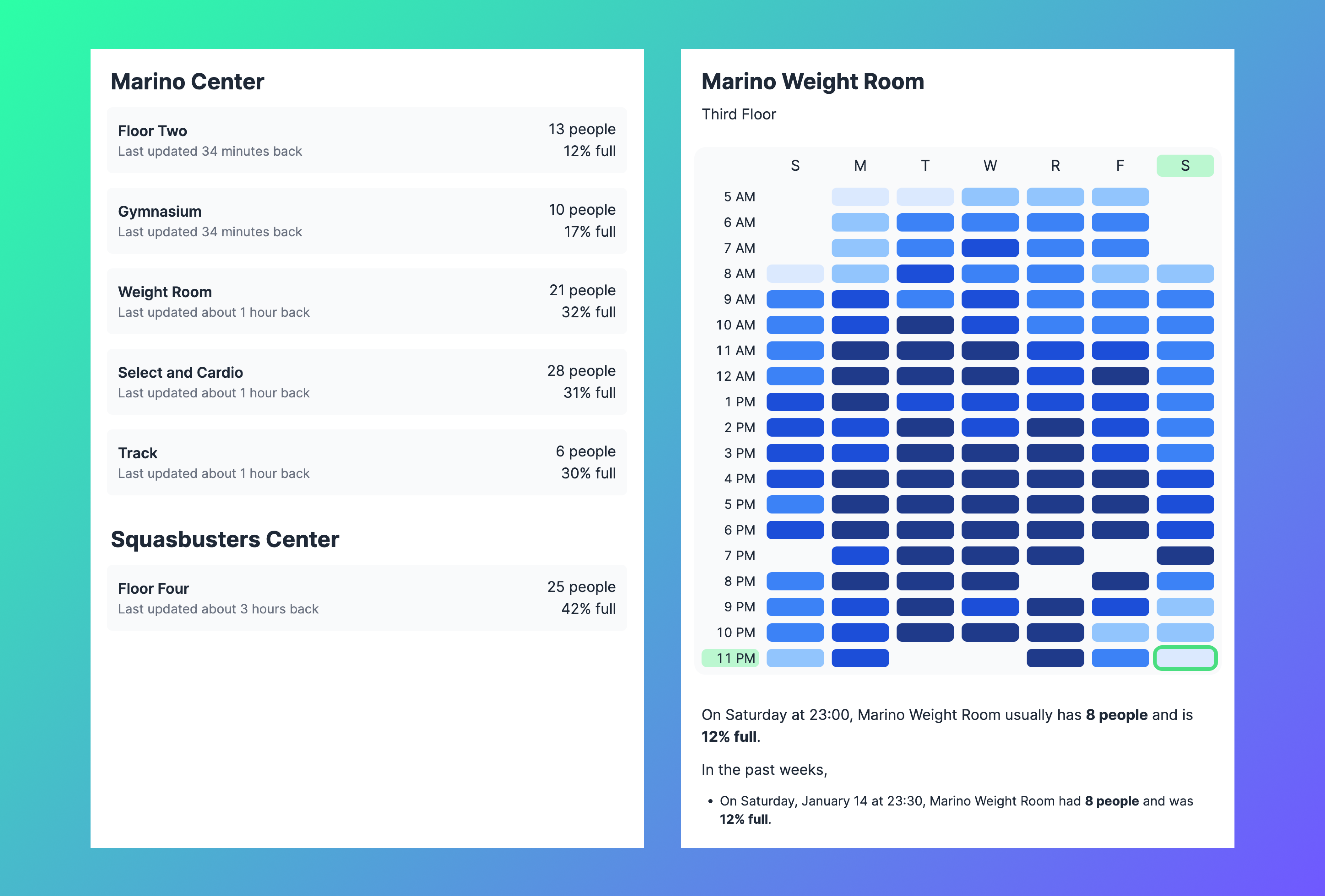
Clicking on any of the gym sections opens the "weak heatmap" view.
This view aims to help find the best times to go to the gym. The shade of blue corresponds to how busy the gym is. For example, this section is very crowded on Tuesdays between 2 and 10 PM, but not that crowded on Thursday mornings.
But while this interface does show the data, they can do better.
Rather than simply showing information, I think it's really important to take full advantage of the web as a medium and display information in a way that's easy to understand and make decisions from.
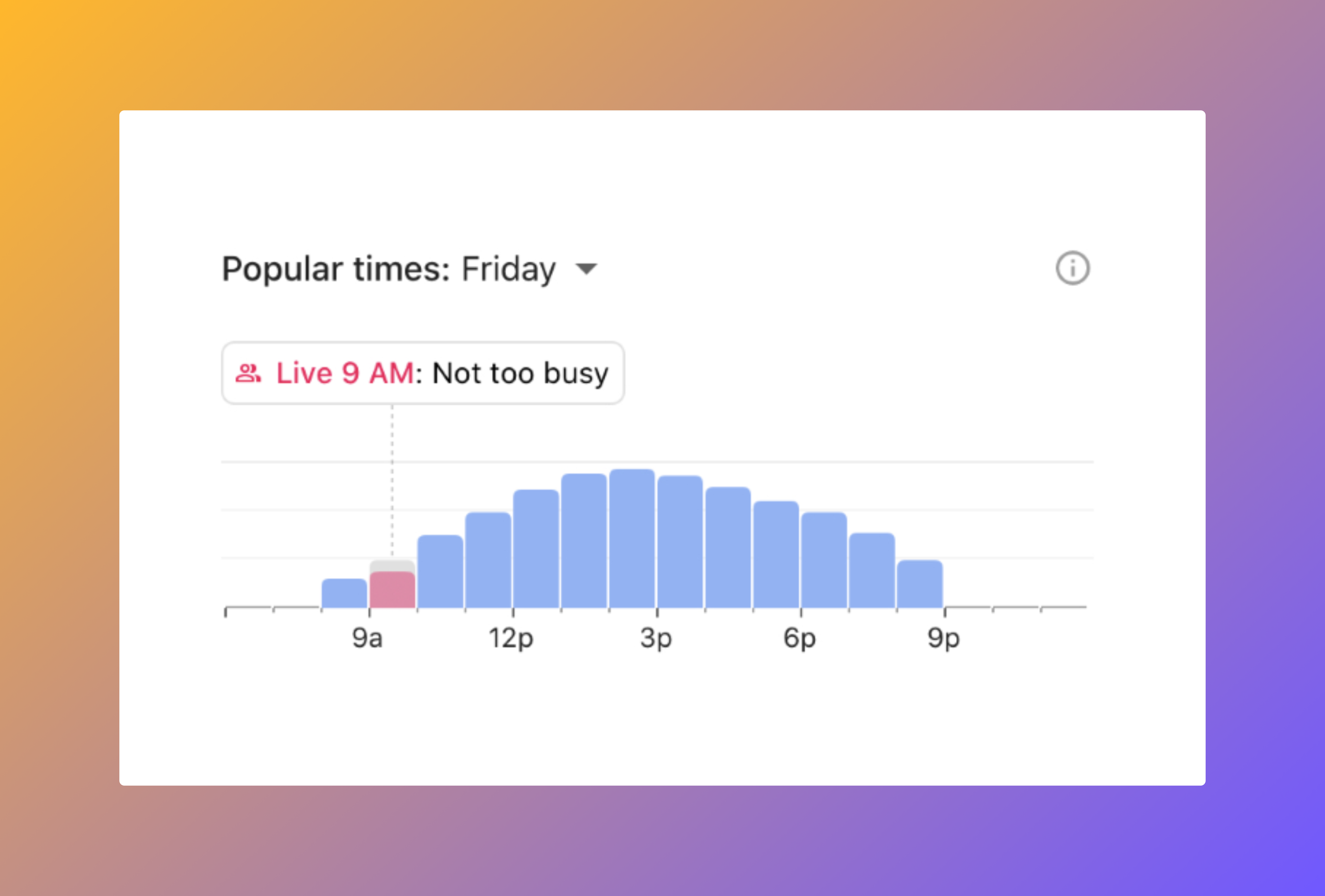
Rather than simply showing numbers like 50 people or 45% full, perhaps it makes more sense to display a bar chart showing how many people were in the gym in the past 2 hours, how many are currently in the gym, and an estimate of crowded the gym will be in the next 2 hours. In addition, rather than having the user understand a percentage like 67%, it would look prettier if the level of crowd was displayed through a color (blue/orange/red) and a description like "not busy", "very busy", ...
That's how Google Maps does it.