I want my expenses tracker's frontend to have two components on the main page:
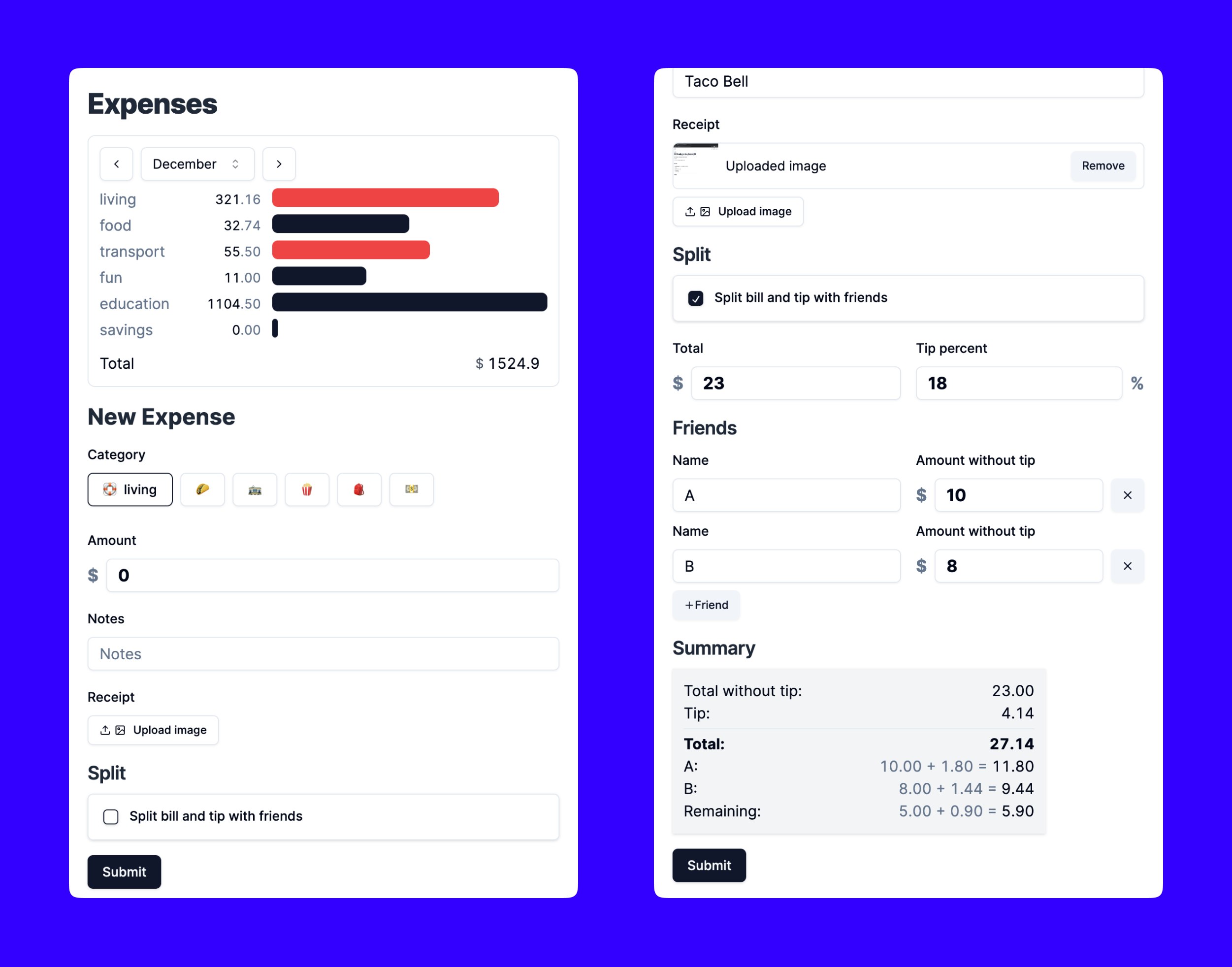
- Month summary showing a breakdown of expenses by category.
- New expense form with tip calculator + cost splitter for the times I eat out with friends. It can get pretty complicated:
- Get the bill
- Calculate the tip and total amount payable
- One person pays the total bill
- Everyone else calculates how much they pay (amount and tip)
Tip calculation example
When I go out with friends, we do NOT split the tip equally. We divide it based on the cost of our dish.
If I go out with one friend and the total bill is $100 + 20%, the tip amount is $20 making the total $120. While it's easy for me and my friend to pay $10 each, it can be quite unfair for my friend if they a bought a $10 dish, and have to pay $10 for the tip.
We calculate it this way:
Total: $100
Tip at 20%: $20
Total with tip: $120

Without tip:
  Friend amount: $10
  My amount: $90

With tip:
  Friend amount: $10 + (10/100 * 20) = $10 + $2 = $12
  My amount: $90 + (90/100 * 20) = $90 + $18 = $108
Version 1

A few comments about this layout:
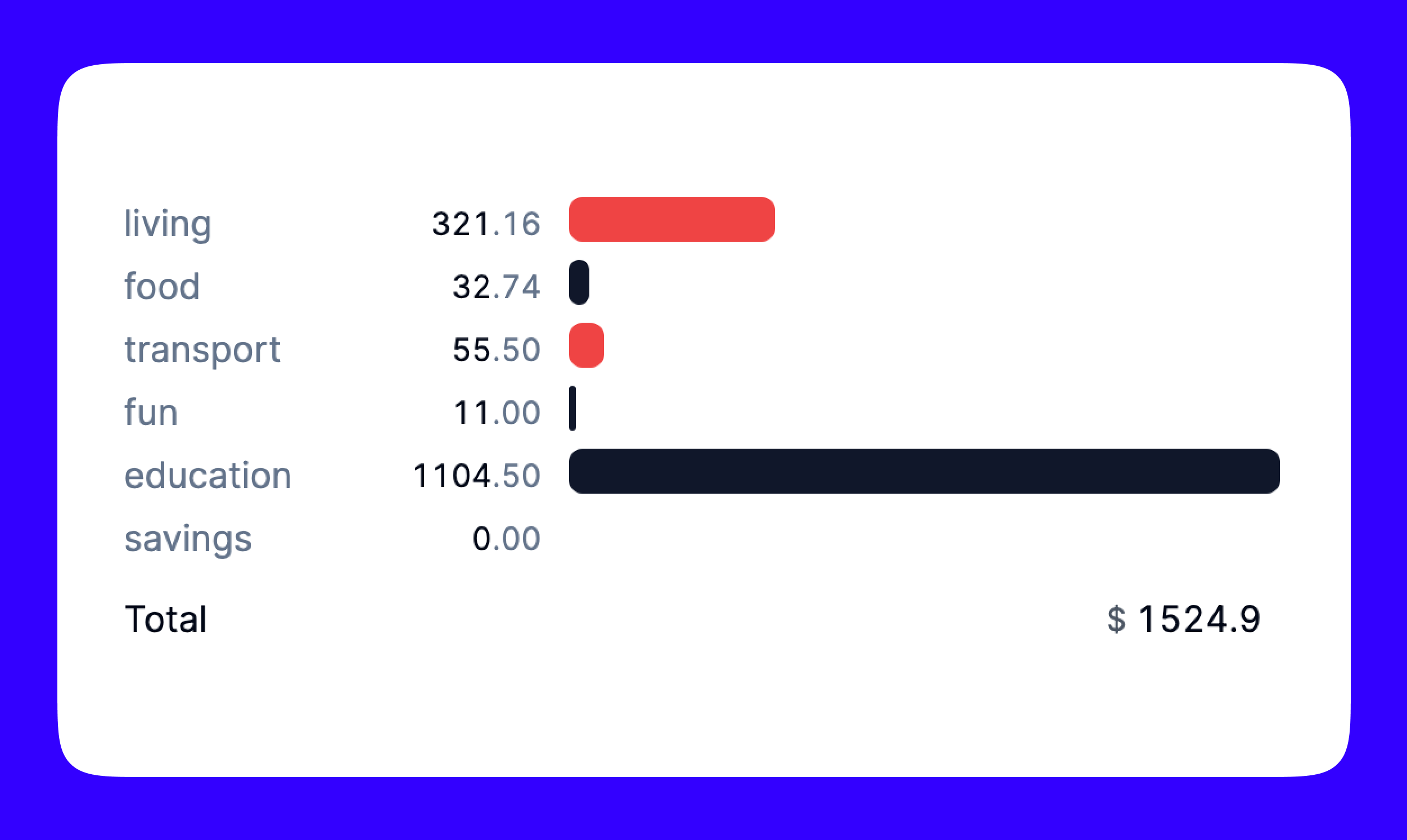
I'm using a log scale for the horizontal bar chart. Some categories (education, school fees) will always have a much higher total amount per month. Having one super long bar makes it difficult to compare spendings across categories.
This is what the graph looks like with a regular scale:

Another issue with the layout, specifically the new expense form, is that it's too crowded. While I usually prefer being more clear and verbose when it comes to long, complex forms, this expense tracker is just for me, and I do not need all the labels.
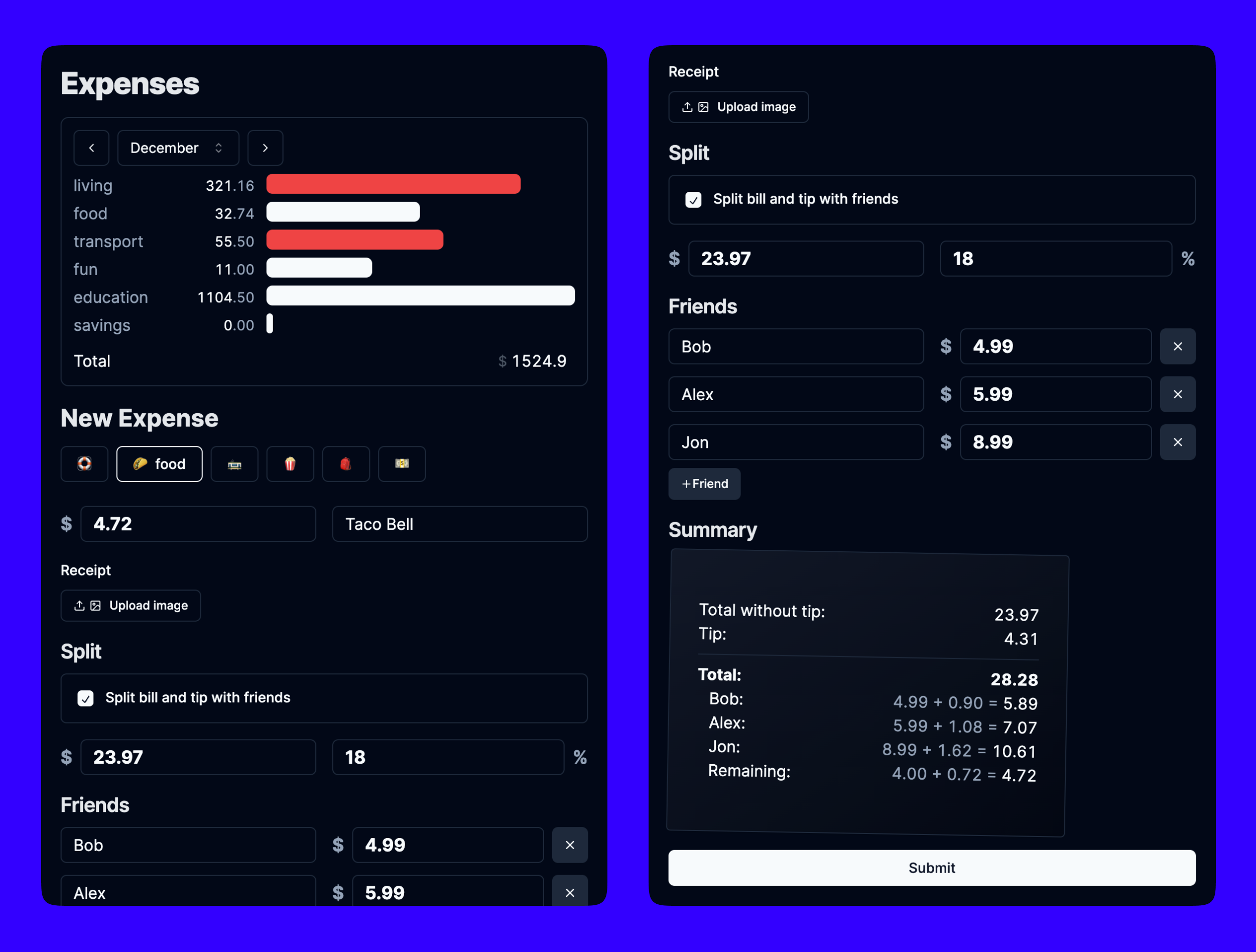
Version 2

Removing the labels makes the form a lot simpler to me. It's completely okay if others don't immediately understand what all the fields are for because I am the only user.
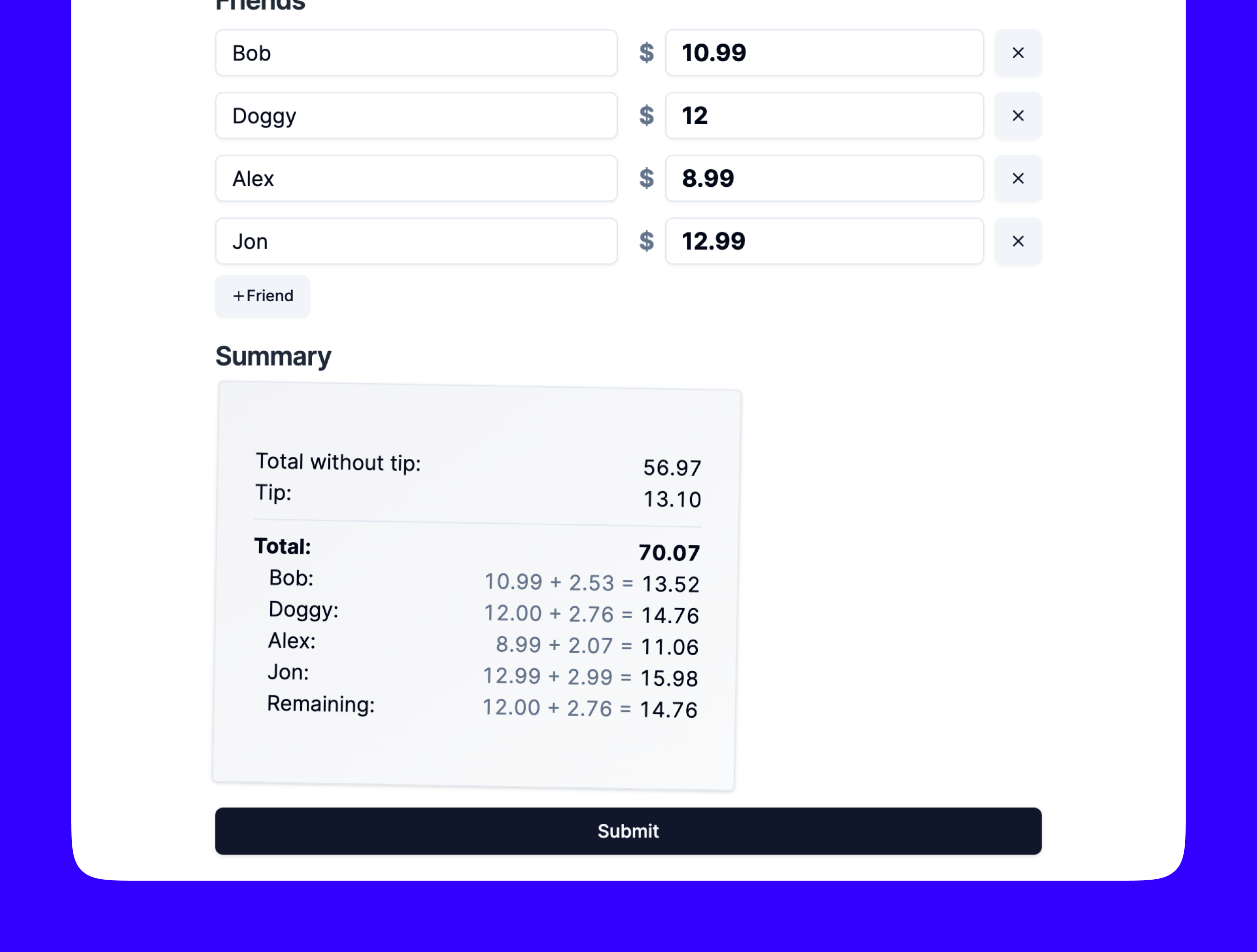
I'm really happy with the "summary receipt" at the bottom. I added a slight rotation and gradient to try and make it look more like a physical receipt.

Update: 2025
I used this for the entire year of 2024, and ... I ended up going back to using Google Forms in 2025.
I made a mistake of making it too hard to add an expense. I used basic auth, so that I wouldn't have to deal with sessions/JWTs or keep a database. This made it suck though, because I'd have to manually type out my password every time I wanted to add an expense. I guess this is also an issue with Safari to an extent, because I don't believe there's a way to save basic auth credentials.
I also didn't really end up using the "Split" features at all. While I thought it could be cool to send everyone a personalized link to pay me back easily, the tip (and tax) calculation proved to be more confusing that I anticipated. All restaurants had taxes (which I forgot about while building this), and some had gratuity fees, or other random fees that my app didn't take into account.
Overall, I'm glad I built this because I sill think it looks cool and it was to work through.
I guess the one thing that came from it is that I can share the link pay.parthkabra.me if I want someone to venmo me!